")


In a world where our iPhones are almost an extension of our arms, it’s crucial that you pay attention to your website design on mobile.
According to recent studies, over half of all website visits are made on mobile devices rather than desktops (source: Statista). So, how to make sure that your website looks good and functions great on mobile devices? In this blog post, I’ll cover the what, how, where, and why of mobile website design best practices.
The What: Mobile Website Design Best Practices
When it comes to designing for mobile, there are a number of best practices to keep in mind. Here are five of my most important for you to pay attention to:
1. Place Call-to-Action Buttons Front and Center
Just make it easy for users to complete the desired action, whether that’s joining an email list or adding an item to their shopping cart. Make your call-to-action buttons stand out and “hit them in the face”, okay Maybe that was a tad bit aggressive, but you know nobody has the patience to be looking for it. Call-to-action buttons should be prominently placed and have clear, concise language that tells the user what they can expect when they click.
2. Keep Navigation Menus Short and Simple
On mobile devices, simplicity is key. Navigation menus should be short and simple, highlighting only the core functions of your product or service. This will help users quickly find what they’re looking for without getting lost in a sea of options. You can always display more menu options on the bottom, but have your main menu functions up high to help people make a decision fast.
3. Use Intuitive Gestures
Mobile users are accustomed to certain gestures, like tapping and swiping. When designing for mobile, it’s important to use gestures that are intuitive and familiar to users. This will help ensure that users can quickly and easily navigate your site.
4. Design for Both Portrait and Landscape Views
I bet you didn’t remember to think of that, did you? I often have to remind myself too. Mobile devices can be held in either portrait or landscape view, so it’s important to design for both. Make sure your site looks great and functions well no matter how the user is holding their phone.
5. Reduce Visual Clutter
Mobile screens are smaller than desktop screens, so it’s important to keep the visual experience simple. Avoid cluttered designs and stick to a clean, minimalist layout that makes it easy for users to find what they’re looking for. I would even recommend keeping a few things on the desktop version only but removing them from the mobile view.
The How: Implementing Mobile Website Design Best Practices
Now that you know the best practices, it’s time to implement them on your site. Here are a few tips to help you get started:
- Use a responsive design that automatically adjusts to different screen sizes.
- Keep your design simple and easy to navigate.
- Use clear, concise language for your call-to-action buttons.
- Make sure your site loads quickly on mobile devices.
- Test your site on different devices to ensure it looks and functions well.
The Where: Examples of Great Mobile Website Design
To get a better idea of what great mobile website design looks like, let’s take a look at a few of my favorites as examples:
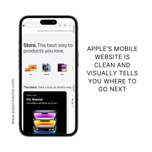
1. Apple
Apple’s website is a great example of mobile website design done right. The site is clean and minimalist, with clear calls to action and easy-to-use navigation.
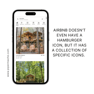
2. Airbnb
Airbnb’s mobile site is another great example of effective mobile design. The site is easy to navigate, with clear calls to action and a simple layout that makes it easy to find what you’re looking for.
The Why: Why Mobile Website Design Matters
Mobile website design is important for a number of reasons, but let me give you a list:
- Mobile usage continues to grow, so it’s important to ensure that your site is optimized for mobile.
- A site that looks and functions well on mobile devices can help improve user experience and increase engagement.
- Mobile-friendly sites are more likely to rank well in search engine results pages.
According to recent studies, over half of all website visits are made on mobile devices rather than desktops (source: Statista). So, optimizing your website for mobile devices is crucial for reaching a wider audience and improving user experience.
Designing for mobile is more important than ever, and by following these best practices, you can ensure that your site looks and functions great on any device. If you’re struggling with optimizing your mobile view or don’t have the time, please reach out, I would love to help you improve your mobile website design.
The FAQ: Frequently Asked Questions About Mobile Website Design
Here are a few frequently asked questions about mobile website design:
Q: What is responsive design?
A: Responsive design is a design approach that allows a website to automatically adjust to different screen sizes. This ensures that the site looks and functions well on desktop, tablet, and mobile devices.
Q: Does my website builder provide optimized mobile design?
A: It depends on the website builder you are using. Some website builders, like Wix and Squarespace, provide templates that are optimized for mobile devices. However, it’s important to test your site on multiple devices to ensure that it looks and functions well. If you’re not sure whether your website builder provides optimized mobile design, reach out to their support team for more information.


Comments Off on Mobile Website Design Best Practices: How to Optimize Your Site for Mobile